SCIENCE VIDEOS MADE SIMPLE
A short guide to making simple whiteboard-style videos for scientists
4. STORYBOARDING
This guide was created in early 2017 to guide a bunch of graduate students through the process of creating simple science videos for general audiences using whiteboards, stick figures, and video capture devices like smartphones (we used Apple iPods, which are no longer available, but the techniques still stand).
Since then the available technologies have improved – for instance, most smart phones will record good audio without the help of an external microphone, and recording apps have evolved. But the basic approaches and principles remain the same. For a more in-depth article on the underlying ideas and process, see here.
Once you have a solid script for your video, it’s time to storyboard it.
With sketch-style videos, this simply means sketching out the drawings you want to film for the video, so that you have a good idea how everything’s going to look before you switch the camera on.
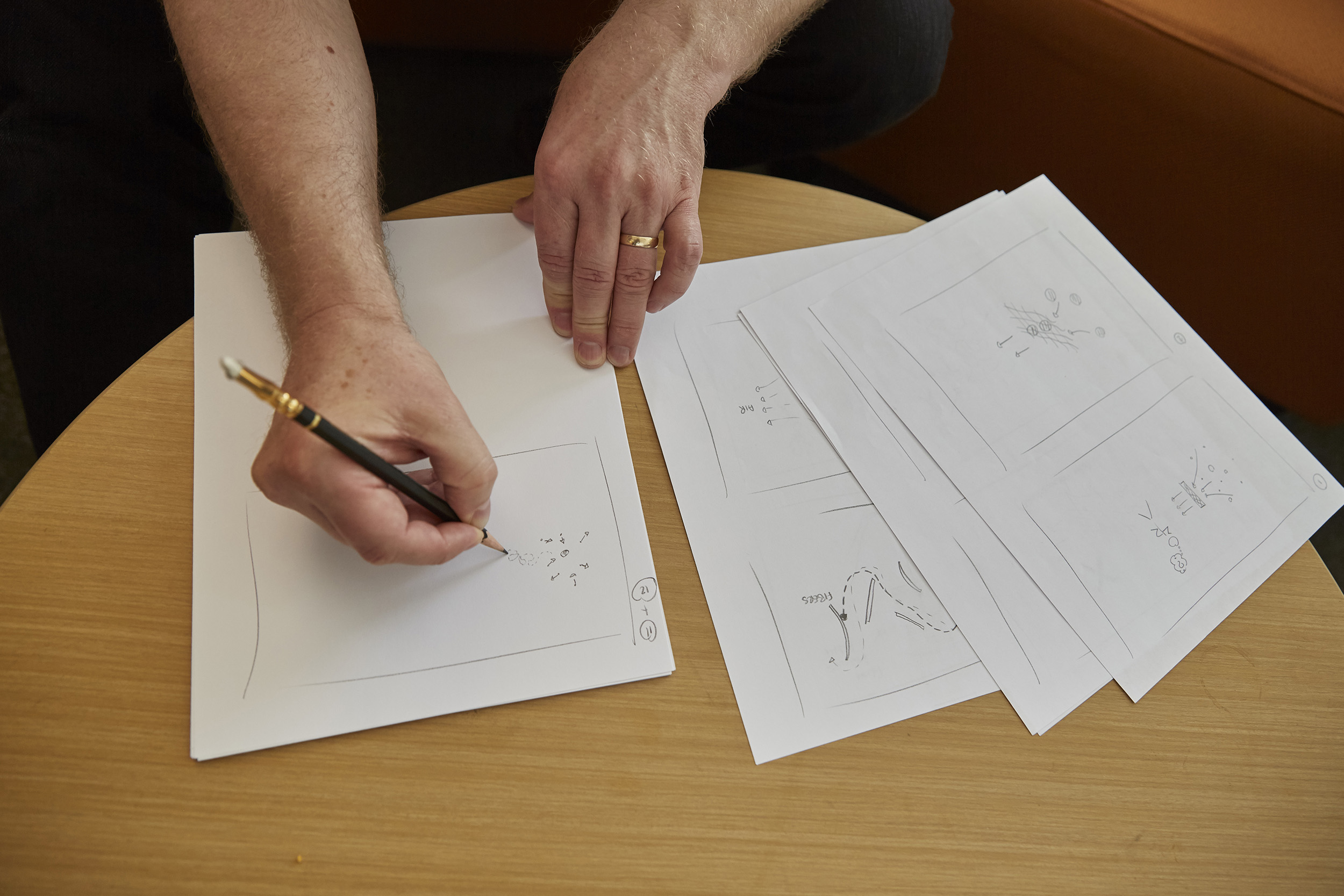
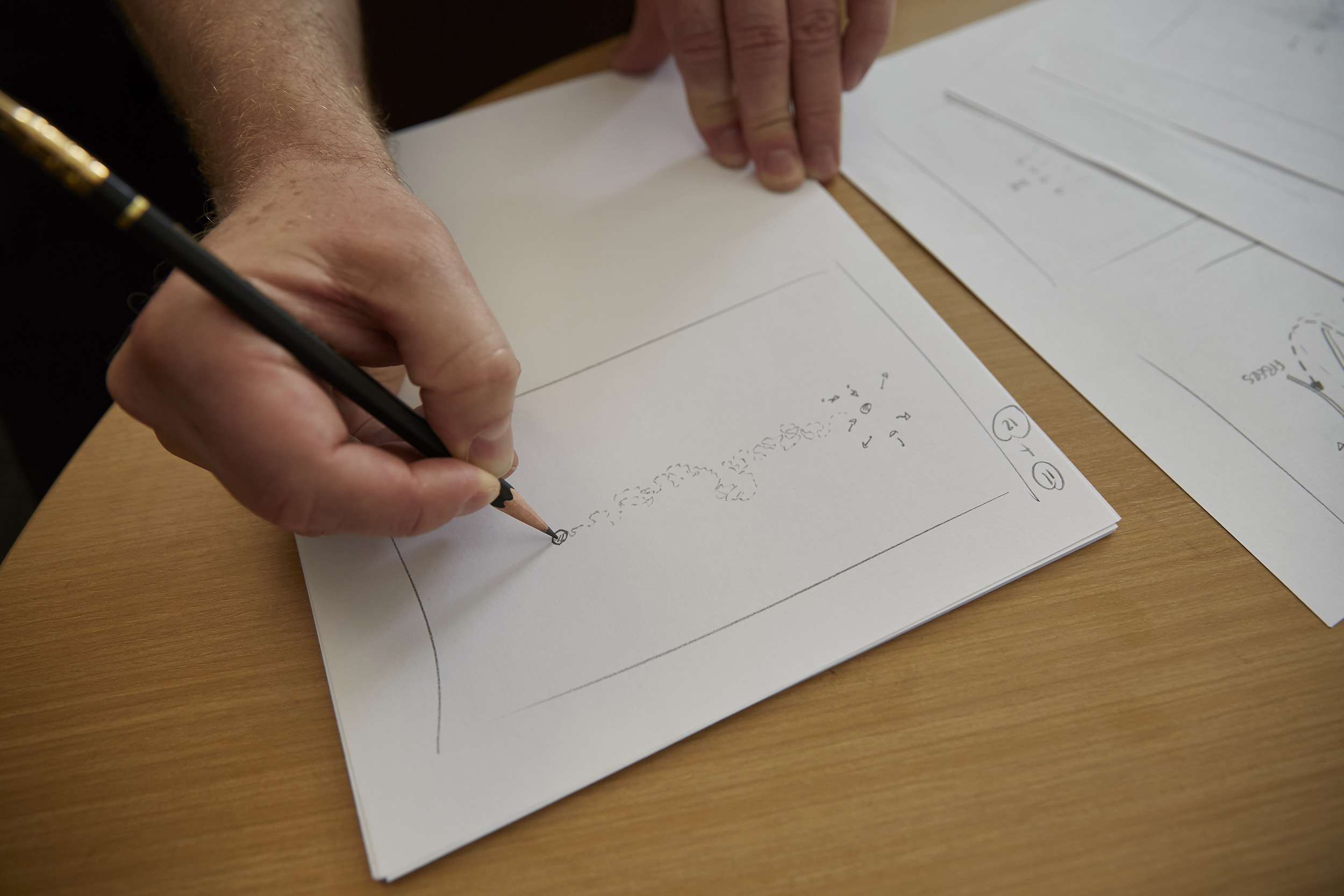
Storyboarding – I draw out two frames per page, and roughly sketch what I want to video in each frame using a soft pencil
Below are the storyboard frames for the How Filters Work video which will provide a good idea of how I do this. But before you get there, here are some important tips and guidelines:
Anyone can draw. Perhaps the biggest challenge here is convincing yourself that you can draw sufficiently well. Pretty much everyone can draw well enough to make simple sketch-style videos — if you can draw a line on a whiteboard, you’re OK!
Sketch-style videos are all about sticking to what you can do and not attempting what you can’t, while keeping things as simple as possible. And the secret here is that, once everything’s speeded up and has a voiceover and music track attached, even the simplest sketches look great!
Keep things as simple as possible. The second challenge is to keep the sketches and the video frames as simple as possible. The aim of the sketches is to enhance and compliment the information in the voiceover. Here, there are two approaches: Illustrating what is being talked about (with sketches that represent directly what’s in the narrative), and adding further information that isn’t in the voiceover. I prefer a hybrid approach — I’ll include some new information in the sketches, but not too much.
To keep things simple here, there are some equally simple tips:
- Don’t be afraid of white space — white space around your sketches helps emphasize what you are sketching.
- Don’t clutter the page — this is pretty much the same as the previous point, but resist the temptation to fill the space. Remember: less is usually more.
- Don’t draw anything that is more complex than you can comfortably manage. Simple shapes can be quite compelling!
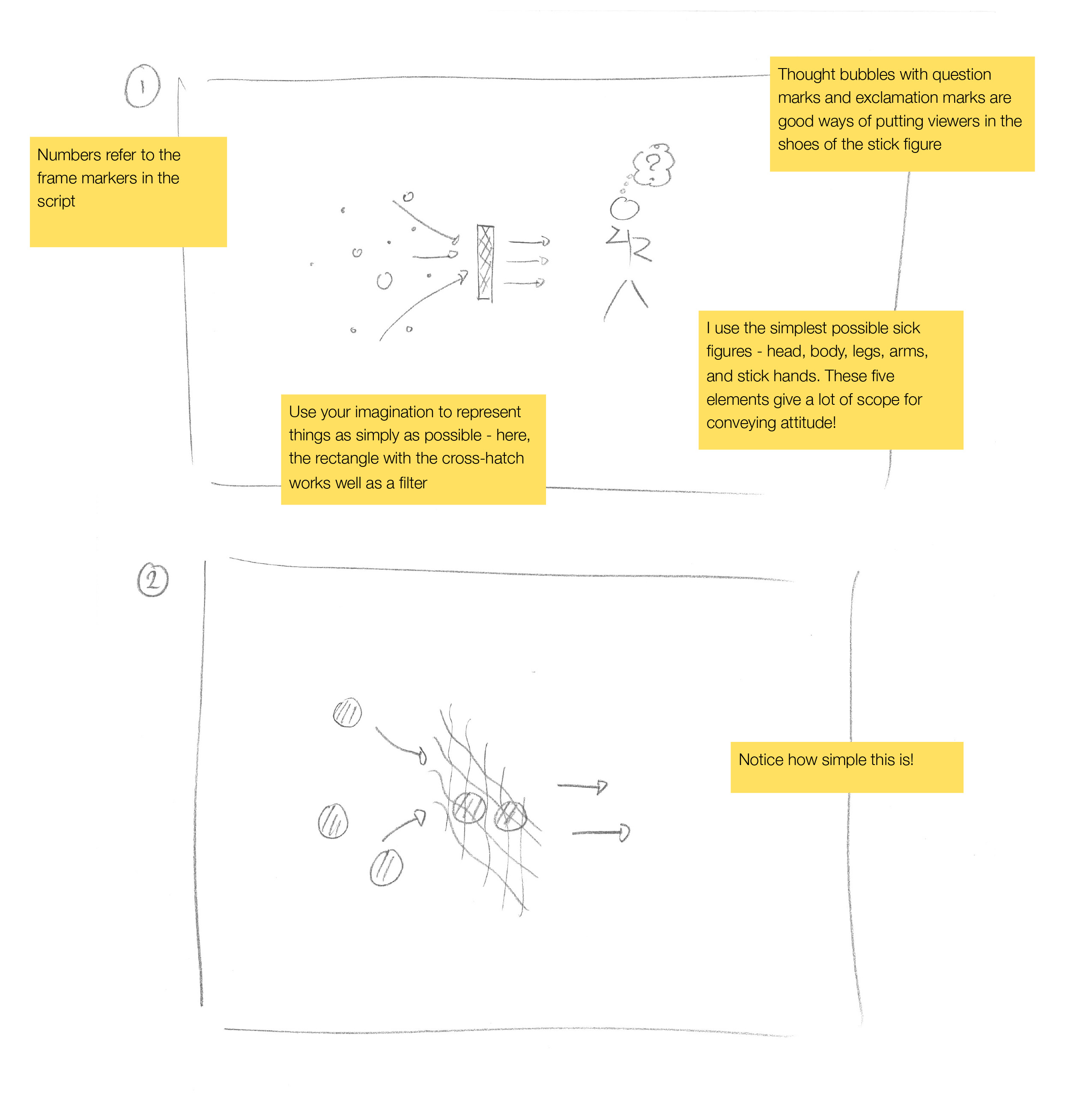
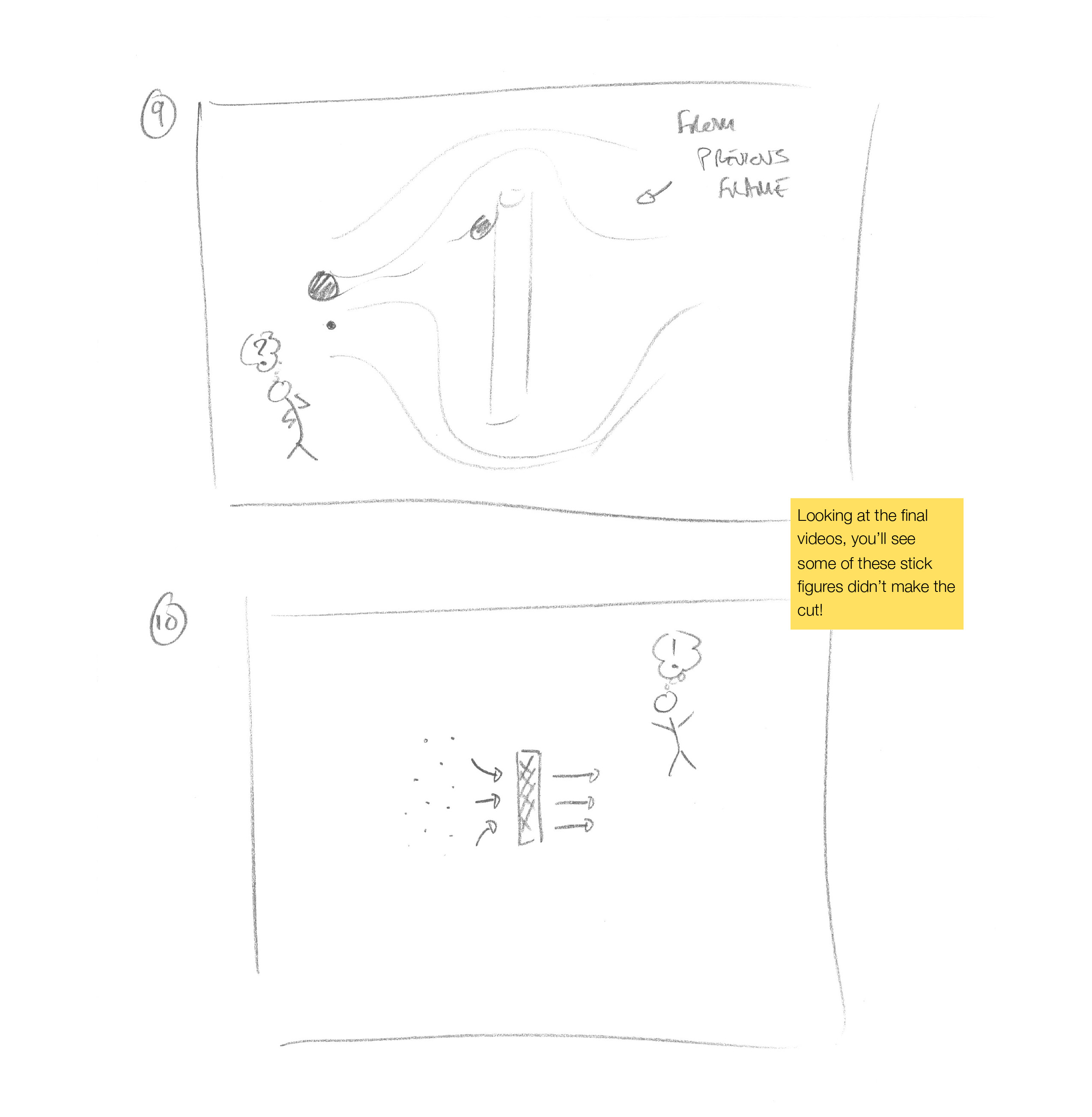
- Very simple stick figures can be remarkably compelling. These are pretty easy to draw – the ones in the frames below are very basic, but they still work.
- You can give figures quite a lot of character by simply altering the angle of the head, arms or legs. Keep your stick figures as simple as possible, and only make them more complex if you know what you are doing. If you want to get more advanced, there are a number of great web-based guides to drawing stick figures — but remember, simpler is better. Here’s one web resource for instance, although this gets quite advanced!
- Be imaginative with your sketches, and how you use a few simple lines to convey ideas. But always remember that simpler is better.
- Only add elements to your sketch if they add something to the story you’re telling. If a line does what you need it to, don’t add a box. If one figure does it, don’t add another. If black and white conveys what you are looking for, don’t add color. And so on.
- Use color with care. It can work — I don’t use it often, but many people do. But make sure that using color doesn’t make it harder to tell your story.
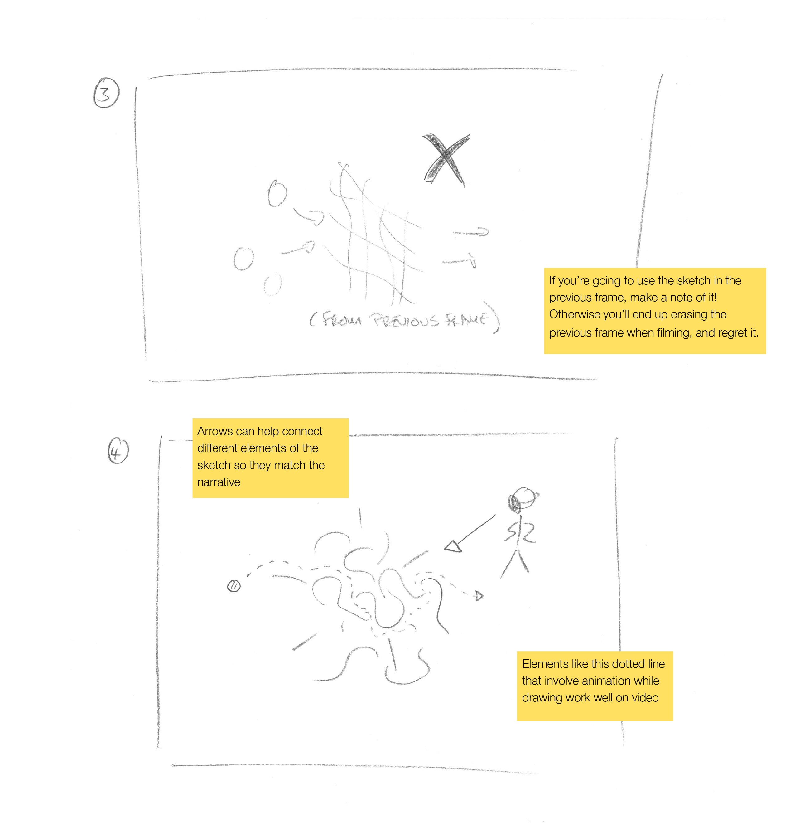
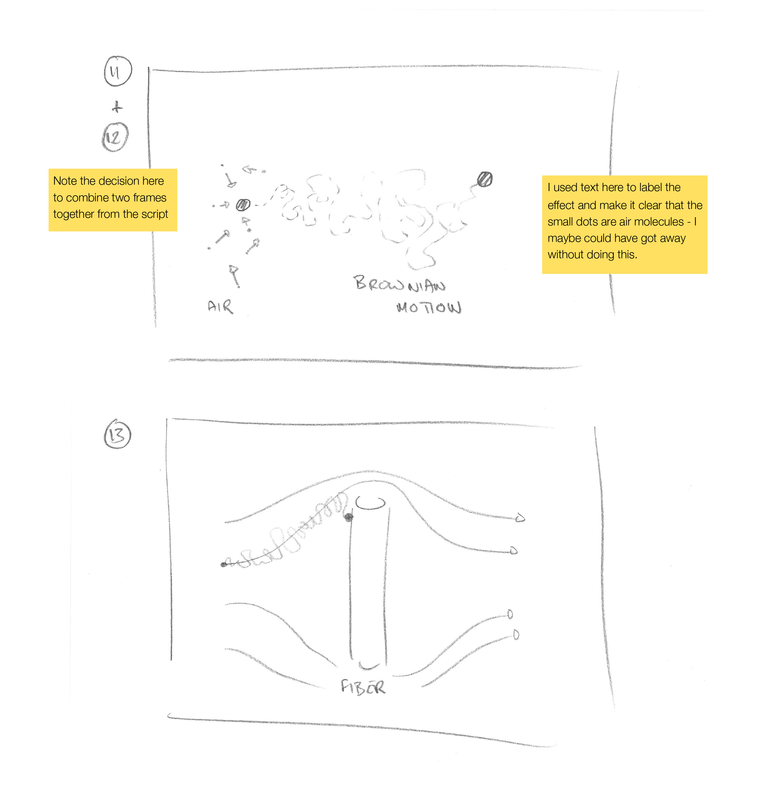
- Try not to use words on your sketches if you can avoid it, and if you do, keep things as simple and as short as possible. I ended up using some words in the sketches below, although you’ll see in the video that I cut some of these out while filming and editing. The beauty of not using words is that the sketches are then independent of the language and reading ability of the viewers.
- Remember that authenticity engages viewers — meaning that they’ll be more likely to watch an enthusiastic and engaging scientist who has limited drawing skills than a professionally produced video. Here, authenticity is your friend!
- And remember that your storyboard is just a series of sketches that help with filming — they don’t need to be polished. Mine never are!
Example Storyboard
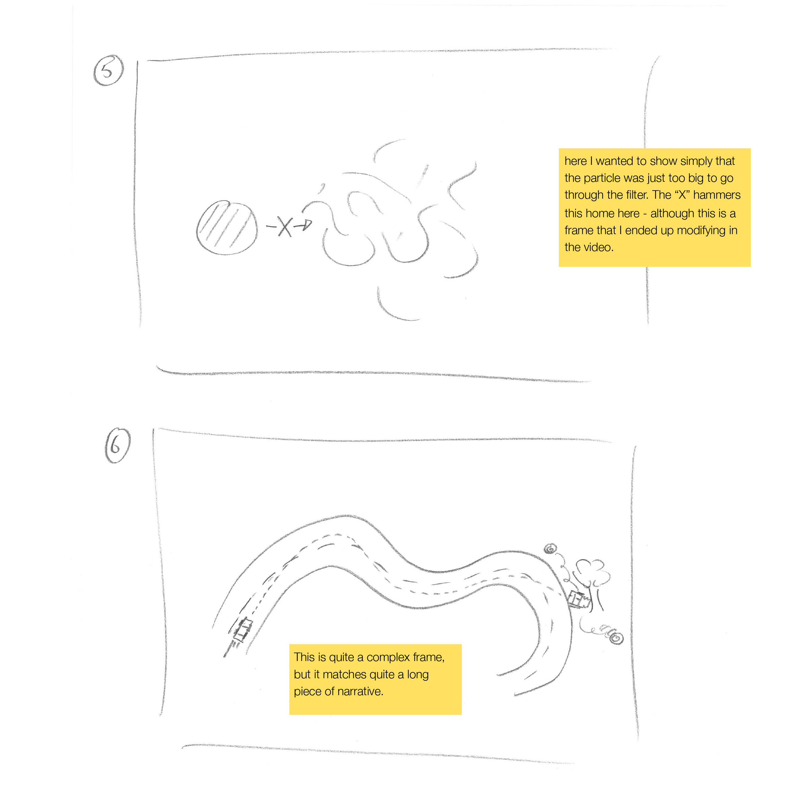
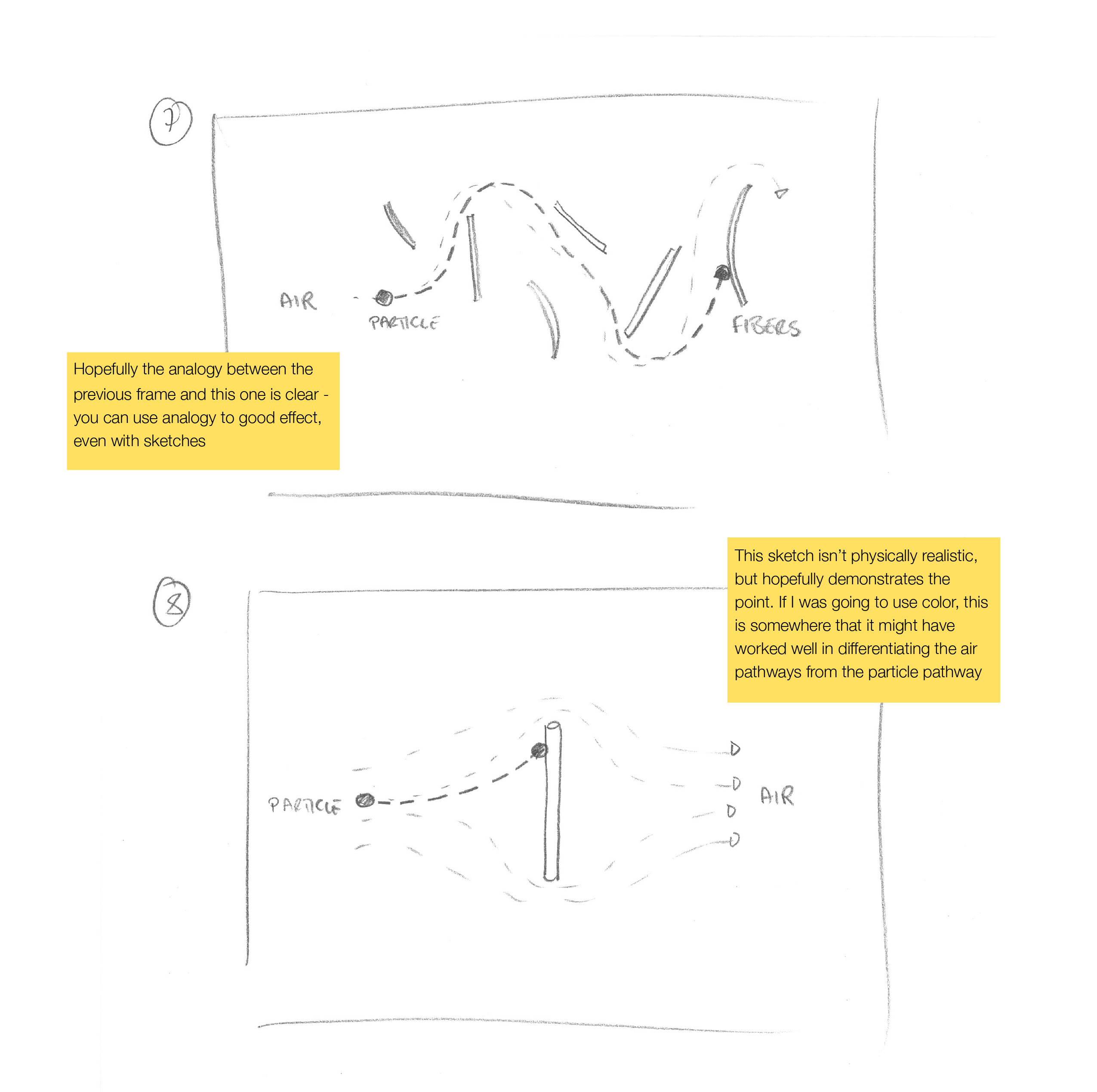
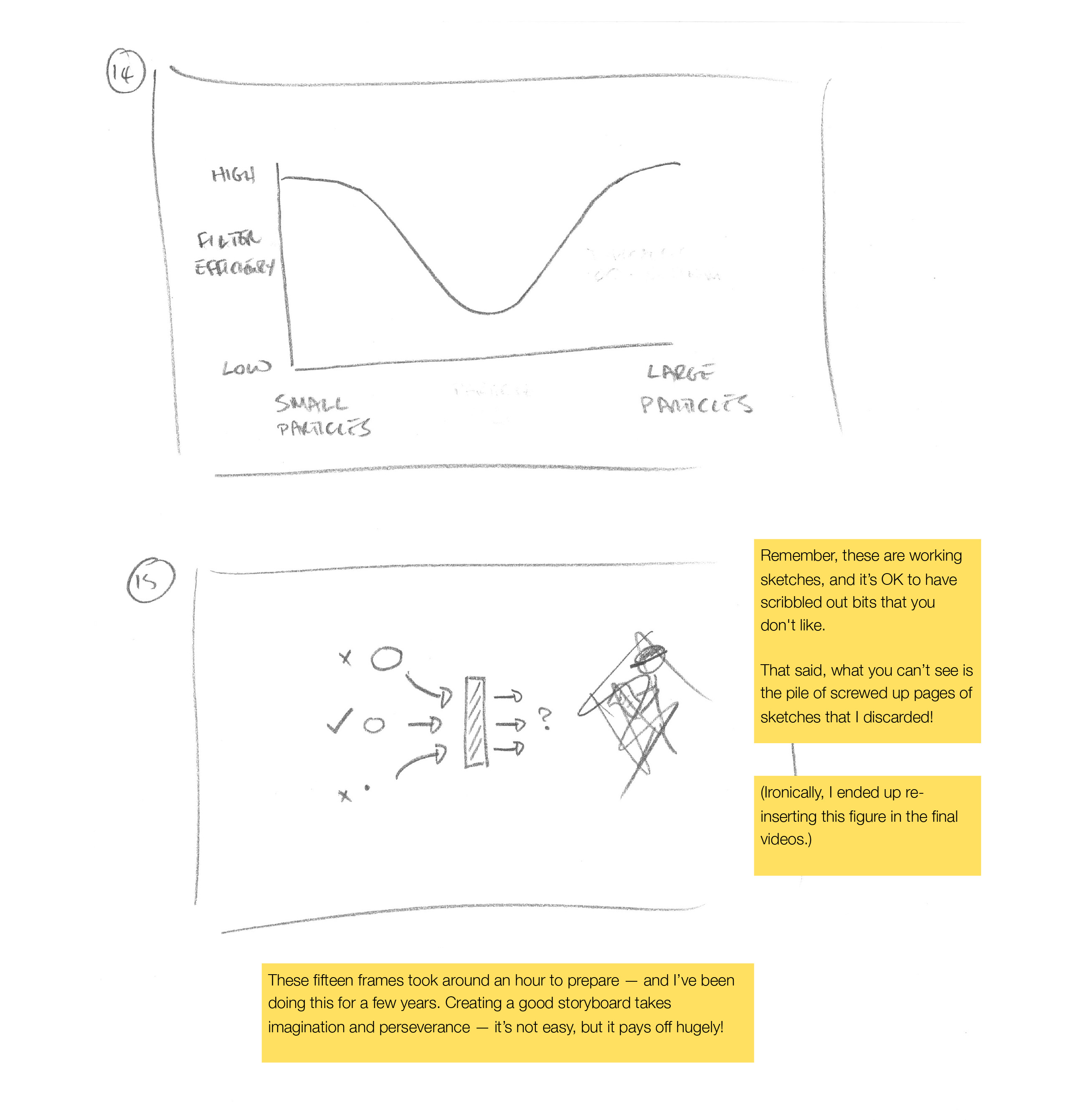
Below are the annotated storyboard frames for the How Filters Work video. As you’ll see, these are scrappy in places, and don’t always match the final video, but they still provide a guide that pays dividends when it comes to filming.
Next …
Modules:
Back to the OVERVIEW
